A banner is easier to design when the controls stay close to the result. The updated QookieQloud customizer gives you one Appearance workspace, a movable toolbox and more room to preview your changes.
 ▶ Watch video: Customize your consent banner
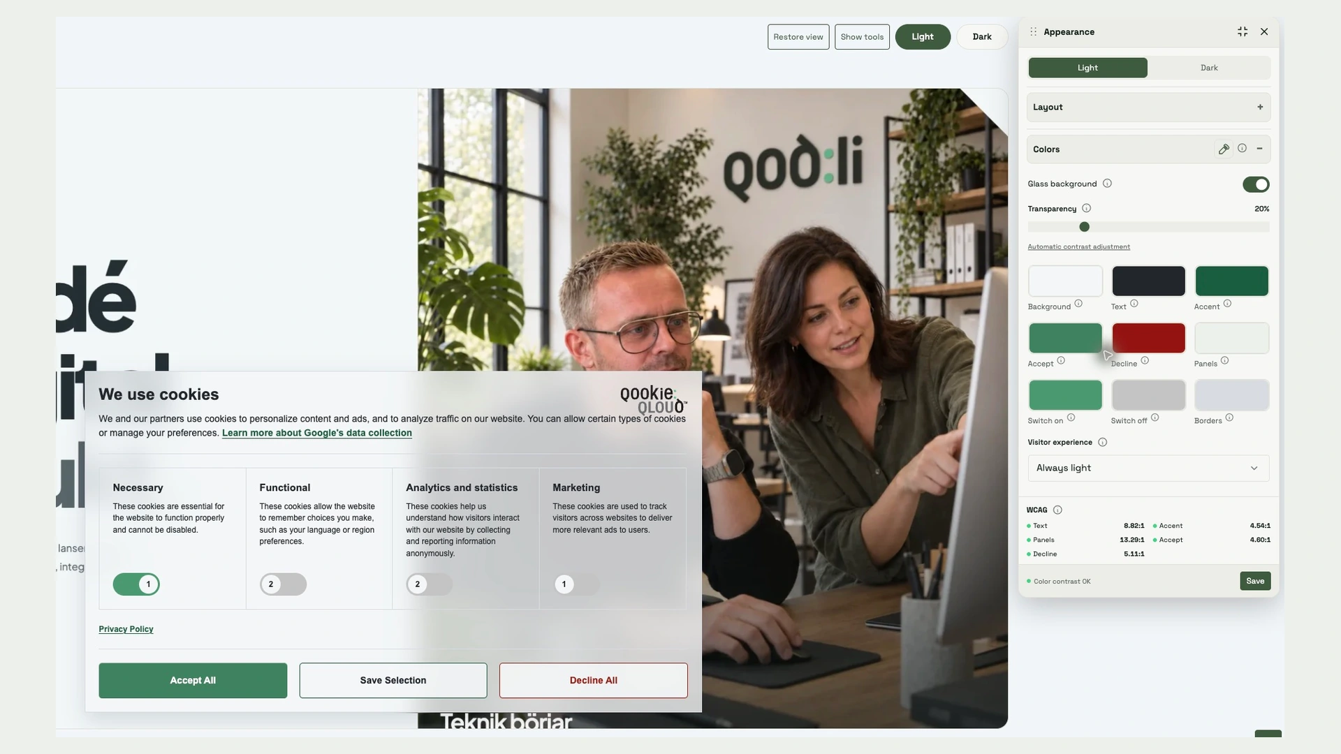
The separate Layout and Colors tabs are now combined in Appearance. Layout and Colors remain as expandable sections inside the floating toolbox.
One workspace for your banner design
The live preview and toolbox open together. Use Layout to choose between all six layouts, set the eye position or turn it off, and adjust corners, shadow and spacing. Drag the toolbox where it suits you. Use the maximize icon in its header to enlarge the preview within the app workspace; click again to restore it.
The introduction and dialog links stay in the expanded panel above the preview. Your logo still has its own tab. In Colors, configure the light and dark palettes separately; color values open in HEX format.
Glass styling, with readability in view
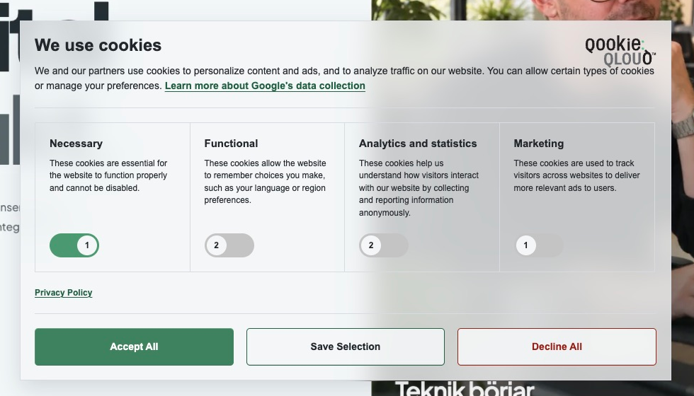
Turn on Glass background in Colors for a translucent, blurred banner. Adjust the transparency or return to automatic contrast adjustment. A saved website screenshot appears behind the preview when available; otherwise an example image is used. Action buttons keep a stronger tint so they remain visible.
If the visitor’s browser signals reduced transparency or forced system colors, the banner switches to a solid background without blur. The info button beside Glass background explains this behavior. Your saved design does not change.
The toolbox keeps the live contrast ratios visible above Save. Review any warnings before saving; these color checks are not a complete WCAG audit. Previewing and fetching colors do not publish changes. Click Save when you are ready.